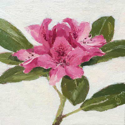
A tricky subject! Painting the flowers so they are defined but not overworked. Simplyfing the pink tones and shapes otherwise its confusing to the eye.
I did paint in a blue background thinking it’s like the sky, but it looked dreadful! It’s now a creamy pink colour (the camera doesn’t pick it up)
I worked on the edges so they were soft, flowers are delicate so a crisp line makes them look cut out and not sit in the painting.
I had trouble getting the cutting to stand up in the glass, bluetack on the bottom, masking tape the leaf to the glass, all didnt work…in the end I raided my husbands garden sand but didn’t realise Rhodies have a short life, I should have put water in the glass as well as sand! It wilted before I finished 🙁
Anyway I’m pleased with the result, and will try some more flowers…

